It is often said that web pages can impact the conversion rate.
How do you make a landing page that converts visitors?
We have 12 examples of landing pages in this article. These examples can be used to inspire you and help improve your conversion rates.
Understanding the purpose of a Landing Page
Before we begin with the examples, it is important to understand the purpose and intent of landing pages during a conversion process.
It is not intended to be a space where you can market your products and services. It is not the main page on your website. It’s any page of your website that a visitor visits after clicking on:
- A button to call for action
- or a link.
Perform a particular action
A landing page’s main purpose is to direct visitors to take a particular action.
This will vary depending on your campaign’s needs.
We often see them being used to encourage prospects to:
- Download an ebook
- Register for an event
- Participate in a promotion
- Sign up for a newsletter or service
- Buy a product
- etc.
Sources of traffic to a landing page
A landing page works in a very straightforward way. A person is redirected to your landing page by clicking on an advertisement on social media or on a website. Clicking on the ad will take them to your landing page. They will find more information about the service that you are offering and a form to complete.
The person becomes a prospect by filling out the forms. They get what they have signed up for. Your data is saved in your database to allow for future promotions and marketing actions.
There is a difference between a landing page and a website
It is important to remember that your landing page does not link to your site. It is independent and designed for visitors to subscribe or use. It dies when the marketing action is completed.
It is crucial that every campaign you run has a landing page. This means that you should have landing pages for every campaign you run, whether you’re promoting an ebook or an event.
12 Examples of Landing Pages
We’ve collected 12 examples of landing pages that convert to help you get started on creating your pages.
Shopify
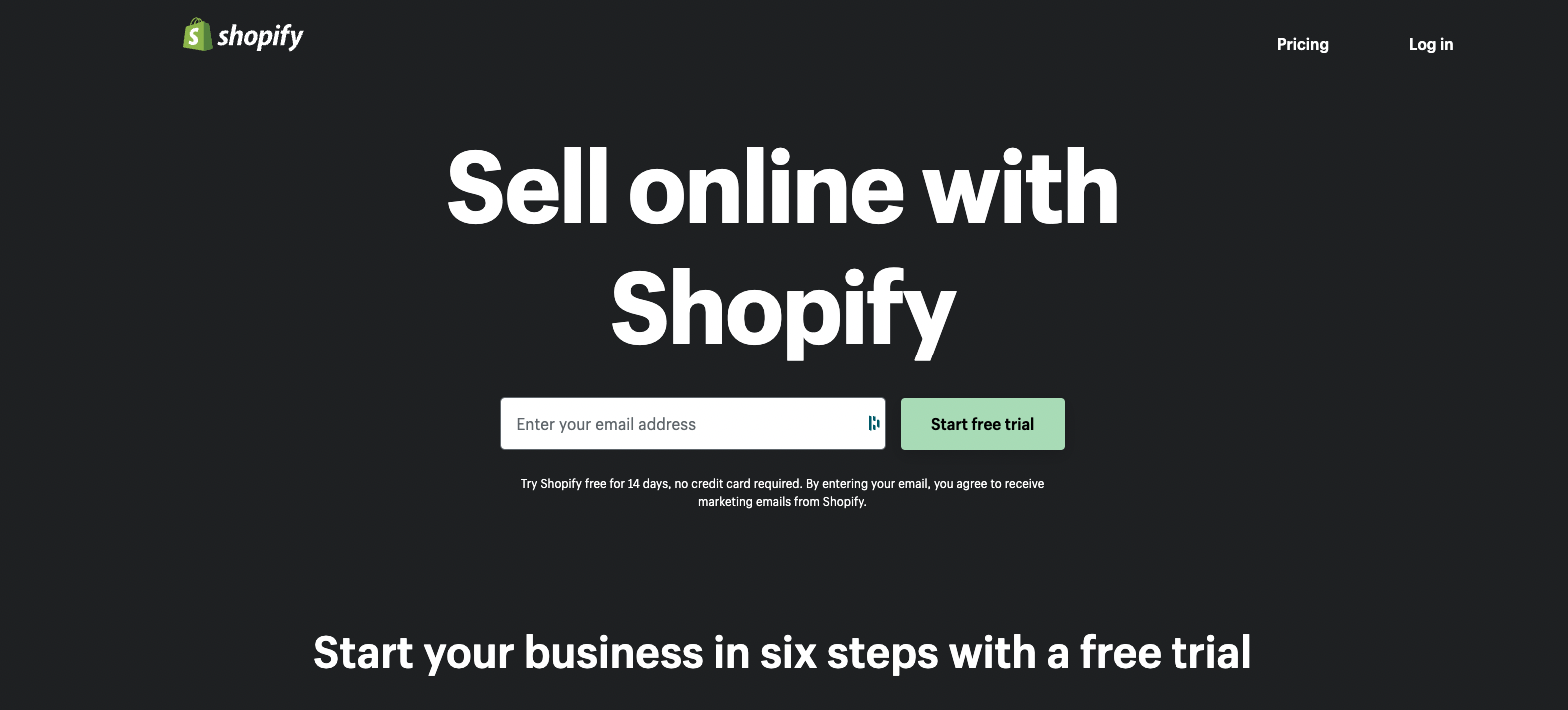
We love this landing page for its simplicity, short text and direct description of product.
In just four words , the title explains what Shopify subscribers will get. Only one piece of information is required: your email address.
For those who want more information, Shopify information can be found at bottom of landing page.
Airbnb
Airbnb, the global rental company, has created a simple landing page. It also contains valuable information for anyone looking to organize trips.
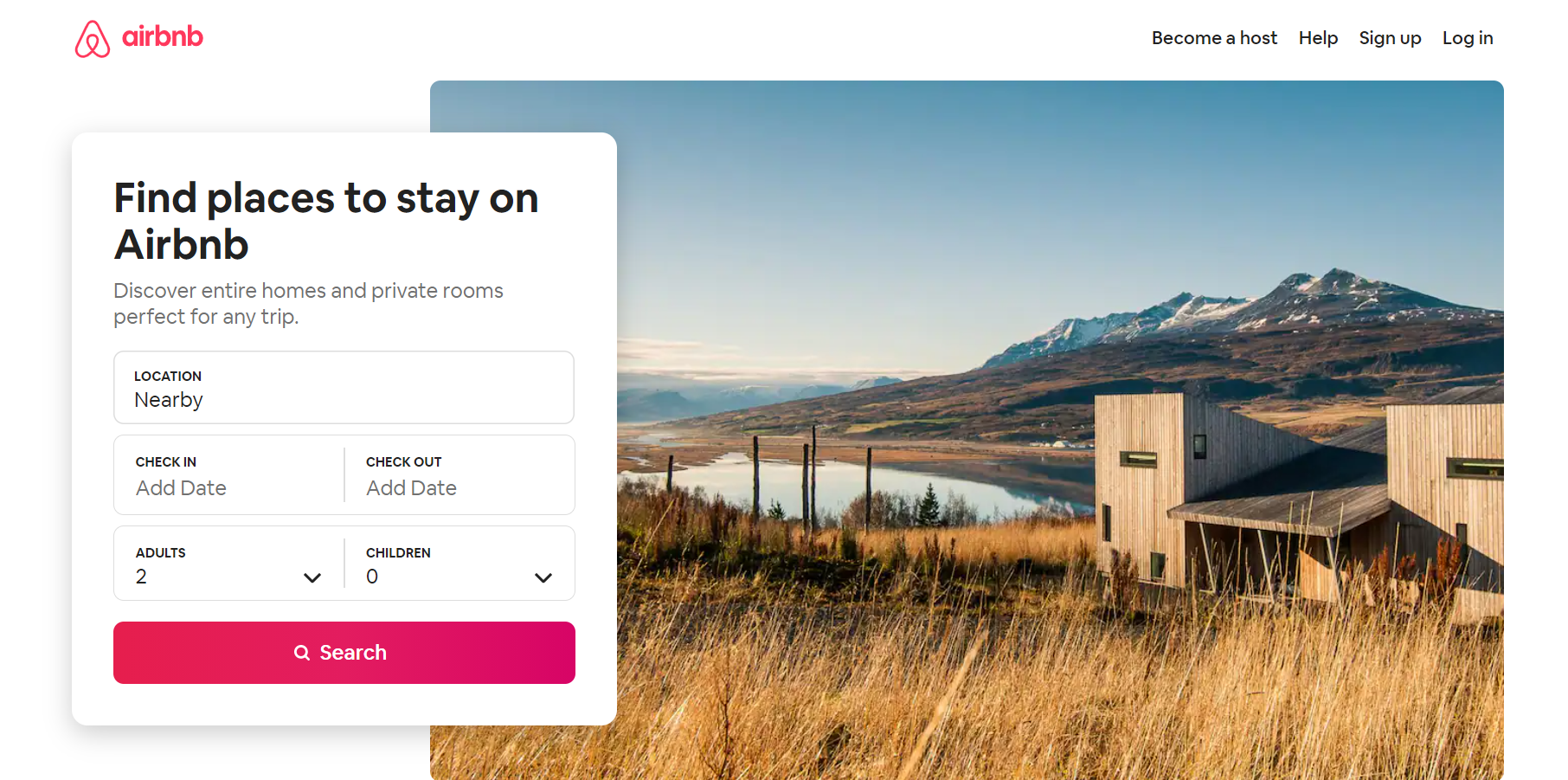
The first visual shows a photo of a landscape.
This form allows you to personalize your results. This is done without sharing any personal data like name and email. You will find testimonials as well as a list of recent bookings.
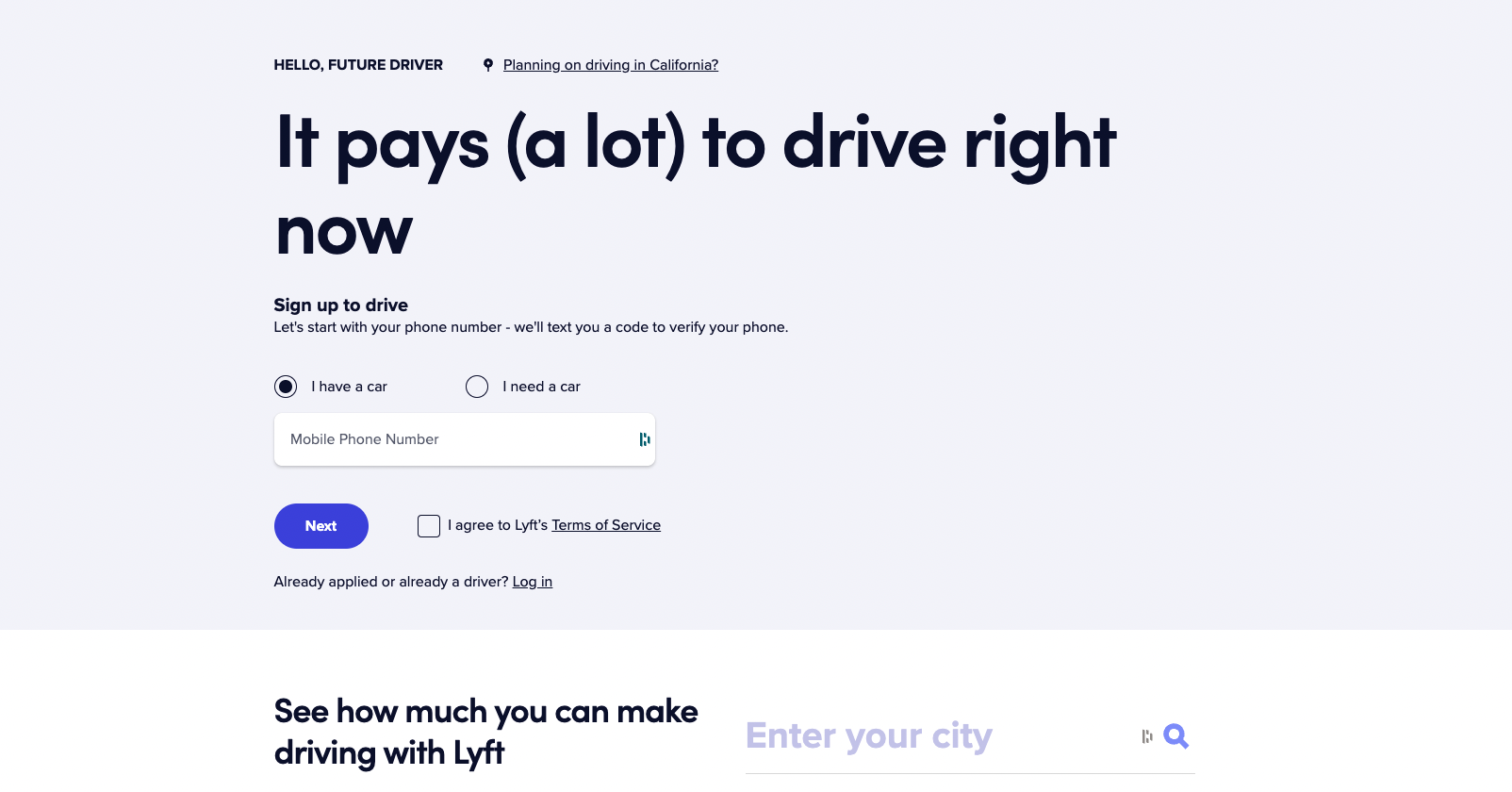
Lyft
No photos, no distractions. A simple background with colourful letters and a headline that emphasizes the main benefits of working with Lyft.
This landing page implements all of the recommendations for increasing conversion rates.
They make every effort to share valuable information with those who are considering this option over the other.
You will also find a dynamic infographic. This section explains how to use Lyft step-by-step. You will also find answers to the most common questions in this section.
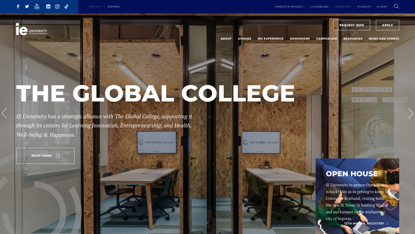
IE University
The Spanish university follows closely. This example shows a very good title, a CTA for the next open house and useful primary information.
They also detail in a graphic why their product is the best available.
You will also find written testimonials that include photos of former students and current positions. The landing page has a consistent call to action that invites readers to contact us for more information or to attend future events.
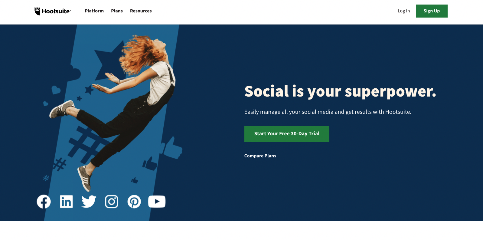
Hootsuite
The headline, along with the accompanying text and Call to Action, are both precise. The brand explains in a few words what the next steps are and what they can expect when they’re done.
The infographic also highlights the many benefits of working with Hootsuite.
They also added a collection of logos from large companies all over the globe that are customers of Hootsuite to reinforce the message that their platform can be used for managing social networks.
Disney+
A simple landing page to give you an idea of what you might get if your subscription is signed up.
Disney has a background that is full of images, which enhances the range of content that all customers will have access to.

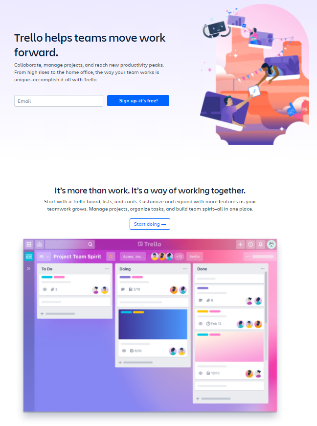
Trello
Trello managed to create landing pages that are more user-friendly, despite having a somewhat busier design than previous examples.
We see here the use of:
- Calls to Action
- Short, simple text
- Images to reinforce the message, and keep the visitor’s eye on it.
- testimonials,
- A precise and intriguing offer.
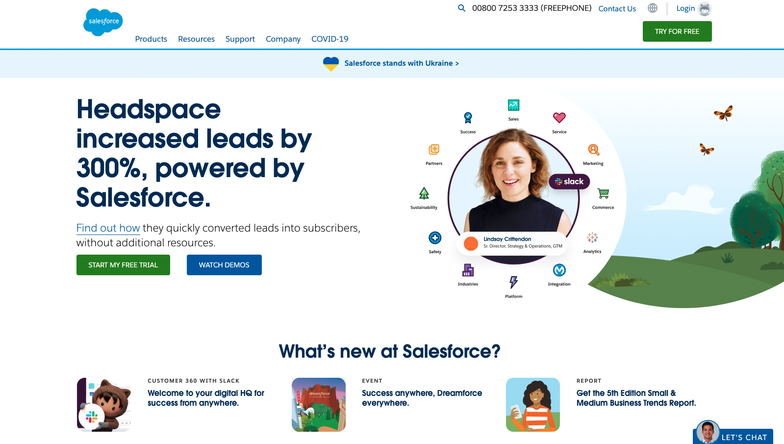
Salesforce
Although you might think that this design seems a little too extravagant, Salesforce’s landing pages can be viewed as an example.
It provides pertinent information throughout the sections that highlights the value of its products and services .
Salesforce describes how they have helped improve the processes of various companies and organizations. Salesforce will tailor a next step to your requirements.
This is why the form is slightly more complete, but not too heavy.
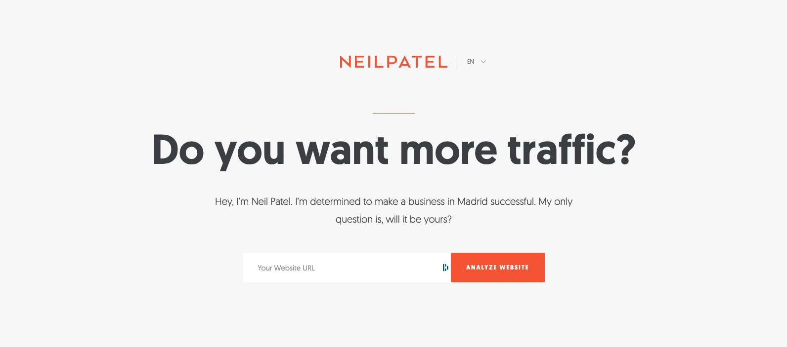
Neil Patel
One of the greatest masters in digital marketing could not help but to have a wonderful example of a landing webpage.
Simple form, brand reinforcement and attribute reinforcement . Short but powerful content . And most importantly, a clean and attractive design that is free from distractions.
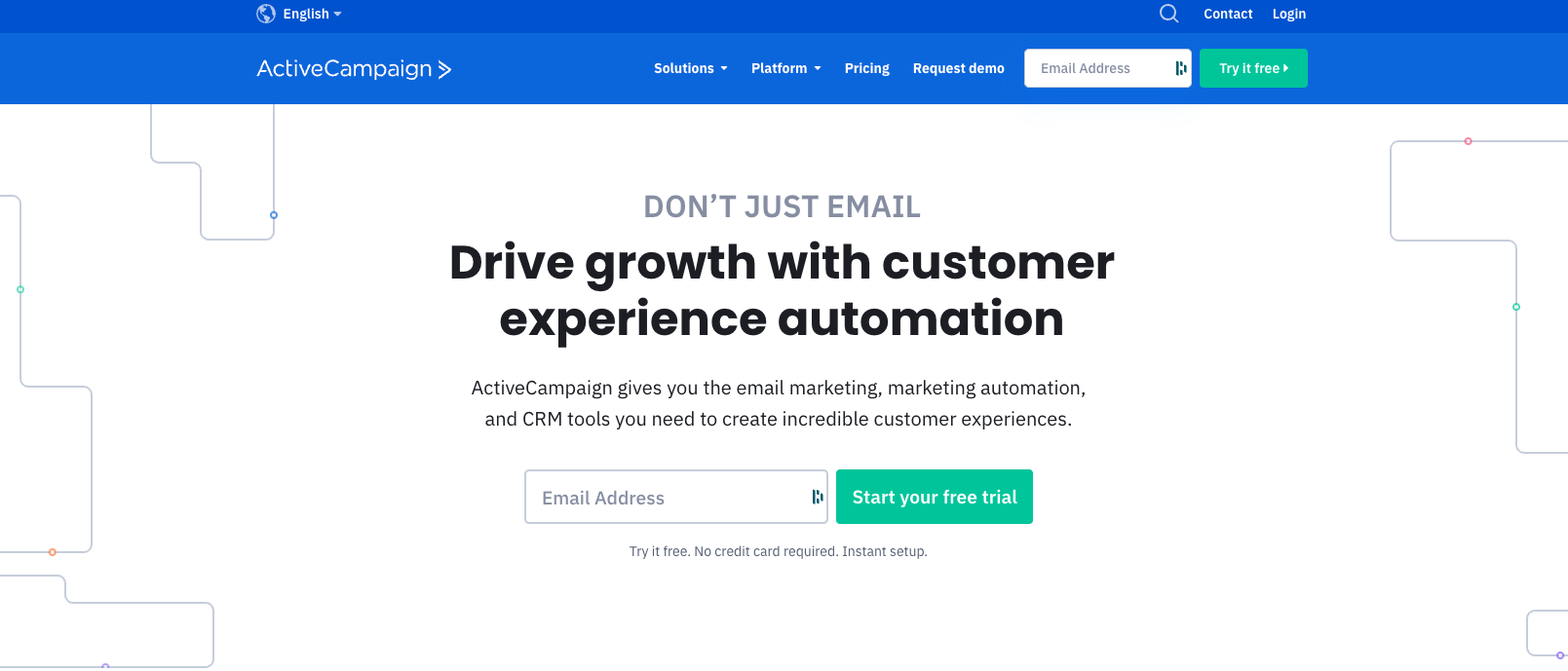
ActiveCampaign
This landing page shows that ActiveCampaign has simplified the design to get visitors to share their email address and begin a free trial.
The large title in the middle of the page reminds us about the advantages of working with them to run successful marketing campaigns.
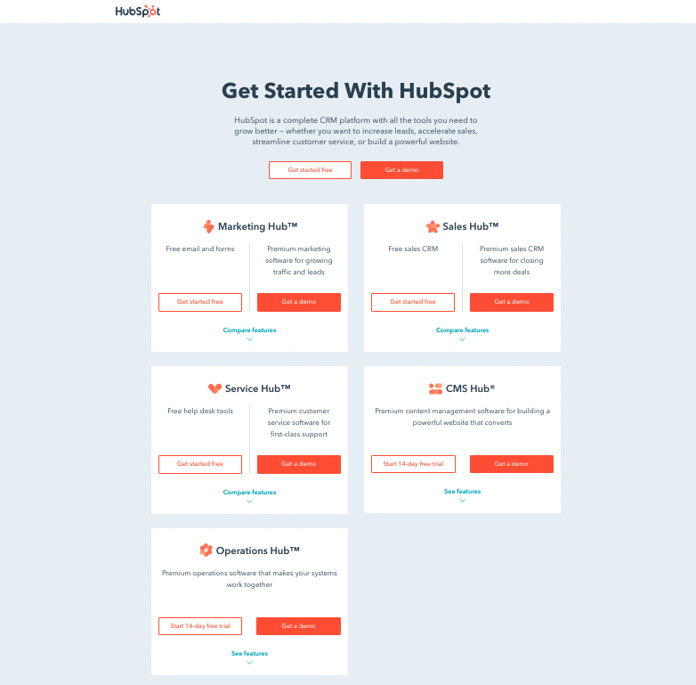
HubSpot
Although we can see 5 products on the landing page, the goal and call to action remain identical: Request a Demo.
It is very simple in design and has some animated elements. However, they are not distracting. Each sub-product has a brief but precise description that helps you understand the differences.
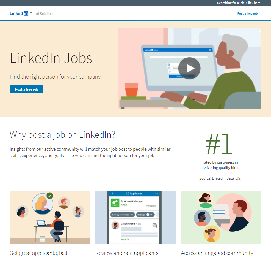
LinkedIn Jobs
The message is clear all through the design: “Post jobs with LinkedIn”.
They dedicate a section to explaining why LinkedIn is the best choice on the market, and another section to describing the steps required to make it work.
Although it contains more graphics than the examples above, the visual aspect serves a crucial function: helping visitors to understand the platform.
Conclusion
Are you ready to create your next landing page? In our article on landing page creation, we explain the steps.
Despite this, there is no single template or design that guarantees the best results. It will depend on your industry, the audience you wish to reach, and the promotion that you are doing.
You must ensure that there are good practices in place, that you pay attention to the operation of the page, as well as the wording and design.
We can help you create the right landing page for your business.