Optimal slogan placement is crucial as it enhances brand recognition and communicates a brand’s values quickly to the audience. Creating a memorable brand identity often hinges on the effective use of both logos and slogans. A well-placed slogan can enhance the overall message of the logo, making the brand more memorable and relatable. This article will explore the foundational elements of slogans and how they work in conjunction with logos to create a cohesive brand narrative.
Understanding the principles of slogan and logo cohesion is key. The distance of the slogan from the logo, its size, and how it aligns with brand aesthetics all play significant roles. Strategic placement across various mediums, such as websites and promotional materials, can greatly influence audience reaction and recall. By considering factors like colour contrast and typography, brands can ensure their slogans not only stand out but also resonate with their target audience.
Slogans are a vital aspect of logo design.
They enhance brand identity, improve recognition, and can foster loyalty among customers.
Key Takeaways
- Optimal slogan placement significantly impacts brand recognition and engagement.
- The size and distance of the slogan from the logo affect audience perception.
- Cohesion between slogan and logo enhances overall brand identity and memorability.
Understanding Optimal Slogan Placement Fundamentals
Slogans are a vital aspect of logo design. They enhance brand identity, improve recognition, and can foster loyalty among customers. Understanding the components of an effective slogan and its role in branding is essential for creating impactful logos.
Importance of Slogan in Branding
A slogan captures the essence of a brand in a brief, memorable phrase. It communicates the brand’s mission, values, or unique selling proposition. A well-crafted slogan can set a brand apart from competitors and resonate with the target audience.
Positioning the slogan correctly is crucial. It should be close enough to the logo to create a cohesive unit but not so close that it feels cluttered. This distance enhances readability and helps with brand recall. Furthermore, an effective slogan contributes significantly to brand recognition. Over time, consumers associate the slogan with positive experiences, which can lead to increased brand loyalty.
Elements of an Effective Slogan
Crafting a strong slogan involves a few key elements. First, the message must be clear and concise. Avoiding overly complicated language helps ensure that the audience understands the brand’s purpose quickly.
Considerations in Slogan Design:
- Length: Ideally, a slogan should be short, typically no more than eight words.
- Clarity: Use straightforward language that conveys a clear idea.
- Emotion: An emotive connection can enhance customer engagement.
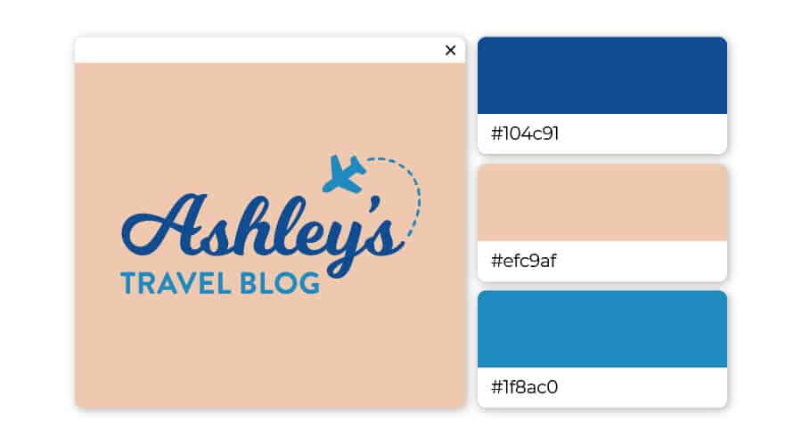
- Visual Integration: The slogan should harmonise with the logo’s colours and fonts. This alignment helps create a unified brand image.
The optimal placement of the slogan near the logo affects audience perception. A balanced proportion between the logo and slogan helps maintain aesthetic appeal, ensuring that neither overshadows the other. Thoughtful design choices reinforce the brand identity and enhance customer recognition.
Also Read: Cultural Sensitivity in Global Branding
The Principles of Slogan and Logo Cohesion
The connection between a slogan and a logo can greatly enhance a brand’s identity. Understanding how to integrate these elements is key to effective brand storytelling and creating memorable experiences for the target audience.
Integrating Slogan and Logo for Brand Storytelling
A slogan should complement a logo to communicate the brand’s story clearly. The optimal slogan placement can influence how the audience perceives the brand’s personality and message. It is crucial for the slogan to be positioned close enough to the logo to establish a visual relationship while maintaining an optimal distance. For instance, a distance of about one logo height is often effective.
The width and proportion of the slogan should also match that of the logo. A too-wide or too-narrow slogan can disrupt harmony. A balanced design reinforces brand recognition and strengthens storytelling. This cohesion helps in conveying the essence of the brand to its target audience, making the overall identity more relatable and engaging.
Creating Memorable Brand Experiences
Memorable brands often create a lasting impact through optimal slogan placement. The position of the slogan can significantly affect audience reactions. For example, placing a slogan directly below the logo tends to catch the eye quickly, enhancing recall.
Incorporating an emotive or descriptive slogan can deepen the audience’s connection to the brand. The use of simple language allows for easy understanding, while catchy phrases can remain memorable. Moreover, when a slogan reflects the brand’s personality, it can resonate with the audience’s emotions and values, leaving a lasting impression.
By ensuring that the slogan and logo work well together, brands can create experiences that are not only memorable but also meaningful to their audience.
Strategic and Optimal Slogan Placement Across Mediums
Choosing the right optimal slogan placement is crucial in enhancing brand recognition. Effective slogan placement is essential for varying formats, as the positioning can significantly impact audience perception. This section discusses the importance of consistency and adaptation in slogan placement for different mediums.
Consistency in Logo and Slogan Usage
Consistency between the logo and slogan strengthens brand identity. When the slogan stays close to the logo, it becomes more memorable. The distance should ideally be minimal to maintain visual coherence.
It’s important to keep the slogan’s width proportionate to the logo. For example, a slogan that is too wide may overshadow the logo, while one that is too narrow can appear insignificant. A balanced approach allows both elements to complement each other.
Using the same font and colour scheme across different materials reinforces brand recognition. This is especially important for items like brochures, business cards, and packaging, where consistent design aids in delivering a powerful message.
Adapting Logo and Slogan for Digital and Print
In digital formats such as websites and social media, slogans should be placed where they capture attention immediately. For optimal slogan placement, slogans can be positioned either below the logo on a website or within social media graphics. Quick readability is key, so the font size must be adjusted accordingly.
For print materials like brochures or billboards, clarity is vital. The slogan should contrast sharply with the background for easy visibility. Including appropriate margins helps create breathing space around the slogan, enhancing its impact.
Emails should feature the slogan in the header or footer, ensuring it is consistently displayed across all communications. This strategy keeps the slogan in the reader’s mind, reinforcing brand awareness through repeated exposure.
Also Read: Logomark and Logotype Ratio – Using Optimal Proportions
Optimising Size and Scale of Slogan for Visibility
Optimal slogan placement is crucial for brand recognition. The size and scale of a slogan significantly influence its visibility and perception. Understanding the right proportions and ensuring scalability are essential to create a harmonious logo design that captures attention.
Balancing Proportion and Importance
When positioning a slogan, it is vital to consider its proportion relative to the logo. A common guideline is to keep the slogan’s width approximately 60-80% of the logo’s width. This helps ensure a balanced appearance without overshadowing the logo itself.
The distance between the logo and the slogan should be at least 10-20% of the logo’s height to maintain clarity. Adequate white space around the slogan enhances visibility and prevents visual clutter.
Proper sizing affects audience reaction. A larger slogan can create emphasis, while a smaller one conveys subtlety. Brands must consider the message they want to project and choose a size that aligns with their identity.
Scalability Best Practices
Scalability is an essential factor in logo design, ensuring the slogan remains legible at various sizes. A slogan must be tested at different scales, such as for business cards, websites, or billboards.
It is important to use a font that retains clarity when scaled down. Sans-serif fonts are often preferred for their legibility in smaller sizes.
Consideration of how the slogan interacts with other elements also plays a role. A well-placed slogan should enhance brand identity without overwhelming the viewer. Establishing a clear hierarchy in design allows the audience to easily understand the brand message.
By following these guidelines, brands can optimise the size and scale of their slogans for maximum visibility and impact.
Also Read: How to Choose the Right Trademark for your Business
The Role of Colour and Contrast in Optimal Slogan Placement
Colour and contrast are essential in effective logo design, particularly regarding slogan placement. The right choice of colours enhances branding and establishes trust, while contrast ensures readability and grabs attention.
Selecting Appropriate Colours for Different Contexts
Choosing the right colours for a slogan is crucial. Different colours can evoke various emotions and convey specific messages. For example, blue often signifies trust, while red can create excitement.
When designing a logo, it is vital to match the colours with the brand’s identity. For instance, a tech company might use cool colours for a modern feel, whereas a children’s brand could benefit from brighter, playful hues.
Additionally, colour combinations must be suitable for the viewing context. If the logo is primarily for digital use, vibrant colours can stand out. In print, colours may need to be adjusted to maintain their impact when reproduced.
Ensuring Readability and Impact with Contrast
Contrast plays a significant role in ensuring a slogan captures attention and remains readable. A strong contrast between text and background enhances visibility, making the slogan more impactful.
When positioning a slogan, it should not blend into the logo but instead stand out distinctly. For instance, light text on a dark background is often more eye-catching.
Slogan size and placement matter too. An ideal width should ensure that the text does not overwhelm the logo but is still easily readable from a distance.
The distance between the slogan and logo can affect audience reaction. A well-placed slogan reinforces the brand’s message without causing distraction, supporting a cohesive design that enhances brand recognition.
Typography and Slogan Presentation
Looka.com says, typography plays a vital role in how a slogan is presented alongside a logo. The right fonts and integration methods enhance brand personality and ensure effective communication. This section will explore how to choose fonts that reflect brand character and how to effectively integrate slogans with logos.
![]()
Choosing Fonts that Reflect Brand Personality
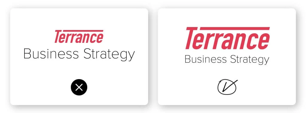
Selecting the right font is essential for conveying a brand’s personality. A tech company might opt for sleek, modern fonts, while a vintage brand may lean towards script or serif styles. This choice can set the tone for how the audience perceives the brand.
Consistency is key in typography. Ensuring that the font used for the slogan matches or complements the logo helps create a cohesive visual identity. Font size should be carefully considered; it needs to be legible yet not overpowering. For instance, a smaller font may work well for a tagline beneath the logo if it contrasts well.
Effective Slogan Integration with Logos
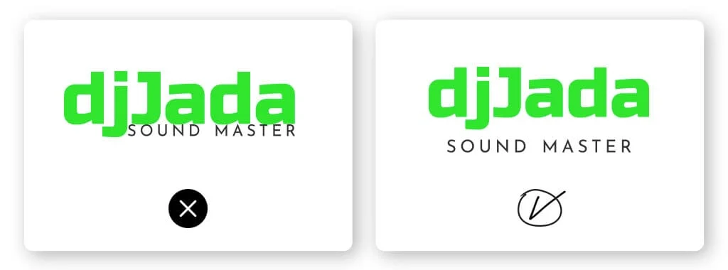
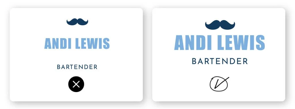
The optimal slogan placement relative to the logo can significantly affect audience response. Typically, the slogan appears directly beneath or beside the logo, maintaining a clear visual relationship. This keeps the branding unified and easy to remember.
Distance matters. A well-measured gap between the logo and the slogan prevents overcrowding while ensuring they are seen as connected elements. The optimal width of the slogan should not exceed two-thirds of the logo’s width to maintain balance.
Proportion also plays a crucial role. A slogan that is too large can distract from the logo, while one that is too small may go unnoticed. Ultimately, effective integration draws viewers in and reinforces brand messaging without compromising legibility or visual impact.
Logo and Slogan Alignment with Audience Expectations
Understanding how to align logos and slogans with audience expectations is crucial for effective branding. Proper placement and messaging can significantly enhance brand identity and user experience. The following subsections explore key aspects that help tailor slogans to consumer needs.
Identifying and Understanding Target Demographics
To connect with the right audience, it is vital to identify and understand target demographics. This includes factors such as age, gender, income level, and interests. By knowing who they are, brands can create slogans that resonate well.
For instance, a slogan targeting younger consumers may use casual language and pop culture references. In contrast, a more sophisticated audience might prefer a formal tone.
Distance also matters. Keep the slogan at an appropriate distance from the logo to ensure clarity. An optimal width allows the slogan to complement the logo without overshadowing it.
Tailoring Slogan Messages to Consumer Needs
Tailoring slogan messages involves addressing the specific needs and preferences of the consumer. A well-crafted slogan should reflect brand identity while articulating benefits that matter most to the audience.
Using simple and clear language helps build a strong connection. For example, a slogan highlighting eco-friendliness can attract environmentally conscious consumers.
Positioning plays a role too. The placement of the slogan—above, below, or beside the logo—can affect how the audience perceives the message. A slogan positioned right under the logo may guide the viewer’s eye seamlessly, enhancing memorability.
By taking these factors into account, brands can align their logos and slogans with what their consumers expect and need.
Also Read: 7 Foundation Principles of Design – Guide by Enthof
Assessing Optimal Slogan Placement for Maximum Brand Recall
Effective slogan placement is crucial for enhancing brand recognition and recall. By carefully considering the distance from the logo, the width of the slogan, and its position, businesses can create a lasting impression on their audience.
The Impact of Placement on Consumer Memory
Placement significantly influences how consumers remember a brand. Research indicates that positioning the slogan close to the logo can enhance recall. A distance of around 10-20 pixels is often optimal, allowing users to associate the slogan with the brand easily.
The width of the slogan should complement the logo without overpowering it. A ratio of 70% width to the logo is often effective. This balance helps maintain clarity and ensures the slogan remains memorable while establishing brand identity. Additionally, slogans positioned at the bottom or right of the logo can create a cohesive visual flow, impacting how audiences perceive and interact with the brand.
A/B Testing for Optimised Recall
A/B testing is a valuable tool for assessing slogan placement effectiveness. By presenting two versions of a logo—one with the slogan in one position and another in a different spot—marketers can gather data on recall rates and consumer preference. This method allows brands to receive direct feedback on which placement resonates better with their audience.
Through A/B testing, companies can analyse various factors such as consumer reactions and overall brand perception. Making adjustments based on real-world feedback can refine slogan placement to maximise brand impact. This iterative process ensures the slogan supports brand recognition, enhancing the likelihood of consumer recall in a competitive market.
Also Read: 5 Things to Consider Before Designing a Logo
Incorporating Logos and Slogans on Promotional Material
Incorporating logos and slogans effectively on promotional material is crucial for brand recognition. Attention to design and placement can significantly influence how the audience perceives a brand. This section will explore important design considerations and the need for consistency across various platforms.
Design Considerations for Merchandise
When designing merchandise, careful placement of the slogan in relation to the logo is vital. The slogan should be legible and not overcrowded. A common guideline is to keep a distance of about a quarter of the logo’s height from the slogan. This helps maintain clarity.
The optimal width of the slogan should be proportional to the logo. A ratio of 1:3 (slogan to logo width) often works well. If the slogan is too long or too short, it can affect the overall visual balance.
Consider the merchandise type as well. For apparel, both logo and slogan need to be sized appropriately to ensure visibility from a distance. On packaging, they should complement the product, enhancing brand recognition without overwhelming the design.
Creating Cohesive Brand Material across Platforms
Consistency across platforms is essential for brand identity. Logos and slogans should be used uniformly on promotional items, social media profiles, and email signatures.
In social media, the positioning of slogans can vary. They may be placed below the profile picture or incorporated into cover images. The distance from the logo should remain consistent with the overall brand guidelines established.
Email signatures should include both logo and slogan for immediate brand recognition. Ensure that the sizing remains appropriate for readability. Using a clear font and consistent colour scheme increases professionalism.
Maintaining these design principles across various media helps create a cohesive brand image, making it easier for the audience to connect with the brand.
Also Read: 10 Powerful Brand Logo Design Tips To Get You Started!
Final Thoughts
Considering slogan placement in logo design is essential for effective branding. The distance between the slogan and the logo affects their connection in the viewer’s mind. If too far apart, the message may get lost.
The optimal width of the slogan should complement the logo without overpowering it. A width ratio of about 60-70% of the logo’s width tends to create a balanced look.
Proportion plays a key role in ensuring legibility. The slogan should be large enough to read easily, yet not so large that it distracts from the logo. Keeping the slogan proportionate helps maintain visual harmony.
Slogan position significantly affects audience reaction. Placing it directly beneath the logo often creates a strong association, guiding viewers to connect both elements swiftly. Alternatively, positioning it to the side can offer a modern feel, appealing to specific demographics.
In summary, following these guidelines ensures that the slogan enhances the logo rather than detracts from it. This ultimately contributes to stronger brand recognition and recall. Attention to detail in slogan placement is vital for conveying the intended message clearly and effectively.
Frequently Asked Questions
Understanding the optimal slogan placement and integration of a slogan within a logo is essential for effective branding. Proper spacing, alignment, and design choices can enhance visibility and impact. Here are some common questions about optimal slogan placement.