
Many designers struggle with logomark and logotype ratio. That’s the relative proportions between the logomark (symbol) and logotype (name) when developing a pictorial/abstract logo with the business name next to it. This crucial component of logo design has a big impact on visual attractiveness and brand identification. We explore the fundamentals of striking the ideal balance between the horizontal logomark and logotype in this extensive tutorial, providing insights that will help both designers and brand owners.
In order to create equilibrium
the alignment of many lines inside the logotype and the height of the logotype in relation to the logomark are two elements that designers must take into account.
Creating Balance Within the Logo Design with Logomark and Logotype Ratio:
To create a visually beautiful and memorable logo, the logomark and logotype must be balanced. The alignment of many lines inside the logotype and the height of the logotype in relation to the logomark are two elements that designers must take into account in order to create this equilibrium. Here’s how designers can establish balance in logo design:
1. Visual Weight Distribution:
The visual weight of the logomark and logotype should be balanced to avoid one element overpowering the other. This can be achieved by adjusting the size, thickness, and spacing of each element until they complement each other.
2. Proportion and Scale:
Pay attention to the relative proportion and scale of the logomark and logotype. Ensure that neither element appears disproportionately large or small compared to the other, as this can disrupt the visual balance of the logo. An optimal logomark and logotype ratio will help bring balance in the logo design.
3. Whitespace and Negative Space:
Utilize whitespace and negative space effectively to create breathing room around the logomark and logotype. Adequate spacing helps prevent overcrowding and allows each element to stand out on its own while still being visually connected.
4. Alignment and Symmetry:
Maintain proper alignment and symmetry between the logomark and logotype to create a cohesive and balanced composition. Aligning elements along common axes or using symmetry can enhance visual harmony and readability.
5. Consistency Across Platforms:
Ensure that the balance established in the logo design translates consistently across various platforms and applications. Whether displayed on a website, business card, or billboard, the logo should maintain its visual integrity and balance.
6. Feedback and Iteration:
Seek feedback from clients, colleagues, and target audience members to evaluate the balance of the logo design. Iterate on the design based on constructive feedback to refine the balance and achieve the desired visual impact.
7. Simplicity and Clarity:
Keep the design simple and focused to maintain clarity and avoid visual clutter. Eliminate unnecessary elements and distractions that could disrupt the balance of the logo.
8. Brand Identity Considerations:
Consider the brand’s identity, values, and target audience when establishing balance in the logo design. The balance should reflect the brand’s personality and resonate with its intended audience.
By paying close attention to these principles and considerations, designers can establish balance in logo design, creating visually compelling and effective logos that accurately represent the brand identity.
Height Considerations of Logomark & Logotype Ratio:
Making sure the logotype’s height does not exceed the logomark’s height is a key component in reaching the ideal logomark and logotype ratio. By preventing one element from overshadowing the other, visual harmony is maintained. Moreover, harmonizing the height of the logotype to that of the logomark when it consists of two or more lines makes the design look cleaner and more unified.
Here are key points to consider when addressing height in logo design:
1. Logotype Height Relative to Logomark:
The height of the logotype should be carefully balanced relative to the logomark to ensure that neither element dominates the design. When both elements are displayed together, they should appear visually cohesive and complementary in size.
2. Avoiding Overshadowing:
Ensure that the height of the logotype does not exceed the height of the logomark. If the logotype appears disproportionately large compared to the logomark, it can overshadow the symbol and disrupt the overall balance of the logo.
3. Alignment in Multi-Line Logotypes:
In cases where the logotype consists of two or more lines of text, aligning the height of the logotype to the logomark can enhance visual cohesion. This alignment creates a more organized and unified appearance, preventing inconsistencies in height that may disrupt the overall balance of the logo.
4. Maintaining Consistency:
Consistency in height across different elements of the logo is essential for creating a cohesive and visually pleasing design. Whether the logotype is in a single line or multiple lines, maintaining consistent height proportions ensures that the logo maintains its visual integrity across various applications and platforms.
5. Golden Ratio Principle:
When designing a logo with a single-line logotype, applying the golden ratio principle to the logomark and logotype ratio can help establish an optimal height ratio between the logomark and logotype. According to this principle, the height of the logomark divided by the average height of the logotype should approximate 1.618, creating a visually pleasing and harmonious composition.
6. Whitespace Considerations:
Consider the use of whitespace around the logomark and logotype to enhance visual clarity and separation. Adequate spacing between the elements prevents overcrowding and allows each component to stand out effectively while maintaining a balanced overall composition.
7. Iterative Design Process:
Experiment with different height ratios and alignments during the design process to find the optimal balance between the logomark and logotype. Iterative refinement based on feedback and testing ensures that the final logo design achieves the desired visual impact and balance.
By carefully considering height considerations in logo design and applying principles such as proportion, alignment, and consistency, designers can create logos that effectively represent the brand identity while maintaining visual harmony and balance between the logomark and logotype.
Single-Line Logomark and Logotype Ratio:
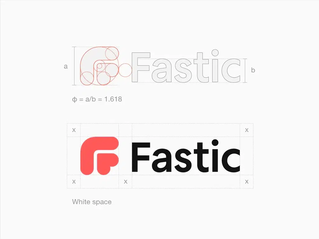
The height of the logotype in respect to the logomark must be carefully considered when it is contained in a single line. A well-known mathematical proportion known for its aesthetic appeal, the golden ratio, can be used as a useful guiding element for this area of design. This principle states that the golden ratio, or around 1.618, should be achieved by dividing the height of the logomark by the average height of the logotype.
Putting the Golden Ratio into Practice:
In horizontal logo designs, the golden ratio provides a methodical way to strike the ideal balance between the logomark and logotype. By following this proportion for logomark and logotype ratio, designers may make sure that each element’s visual weight balances the other out, improving overall aesthetic appeal and brand identification.
Use Logomark and Logotype Ratio in Practice:
![]()
To demonstrate how the golden ratio principle is used in practice, let’s look at a situation in which the logomark is 1000 pixels tall. The golden ratio states that if the logotype is one line, its average height should ideally be 618 pixels. Through the maintenance of this proportionate relationship, designers can produce a visually appealing and harmonious logo that successfully conveys the business identity.
Final Thoughts
Finding the ideal logomark and logotype ratio is crucial for designing a balanced and powerful logo design. Designers may create logos that are memorable to audiences and withstand the test of time by taking into account elements like height, alignment, and the application of design principles like the golden ratio. Understanding and putting these ideas into practice may help designers and brand owners alike improve the visual appeal and efficacy of their logos, paving the way for success in the cutthroat field of branding and design.