When Compass Box Scotch was founded in 2000 by John Glaser, it entered an industry built on long-standing traditions. Most brands relied heavily on heritage, age statements and a certain air of suspense. Consumers were expected to trust the brand without asking too many questions or expecting more information.
Compass Box Scotch Whisky labels approached things differently. Instead of focusing only on age or legacy, the Compass Box focused on source, cask types, blending percentages and the story behind the formulation. Over time, the Compass Box Scotch label became known not just for beautiful label designs, but also for the amount of information it offered. This was unusual in Scotch whisky, where details were often limited.
Compass Box believed that modern consumers wanted more clarity. They saw transparency not as a risk but as a strength. That concept slowly began to influence a wider Scotch universe.
The Traditional Scotch Label
To understand how the Compass Box Scotch Whisky changed Scotch label designs, it is important to understand what came before it.
1. Heavy Focus on Age Statements
Traditionally, Scotch labels highlighted a number … a single number i.e. the age statement. This number represents the age of the youngest whisky in the bottle. For example, if a bottle says “12 years” it means the youngest component has matured for 12 years.
While this system protects consumers from misleading claims, it does not explain the full story. A blend may include much older whiskies, but the label cannot reflect that complexity. This often brings down a rich, layered, complex whisky into one simple number.
2. Limited Disclosure of Components
Most traditional Scotch whisky labels did not reveal:
- Which distilleries were involved
- The percentage of each whisky in the blend
- The types of casks used
- The full range of ages inside the bottle
The industry culture considers blending recipes as trade secrets. Moreover, it added prestige and protected competitive advantage.
This environment made the transparency of the Compass Box Scotch labels stand out even more sharply.
Compass Box Pushes for Transparency
Compass Box decided to challenge this culture of limited disclosure.
1. Publishing Full Recipes
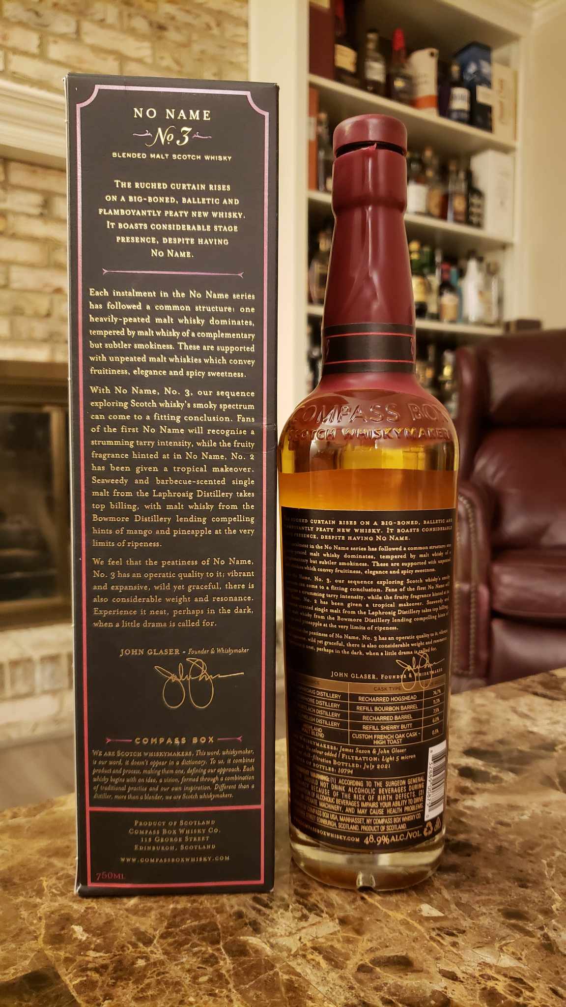
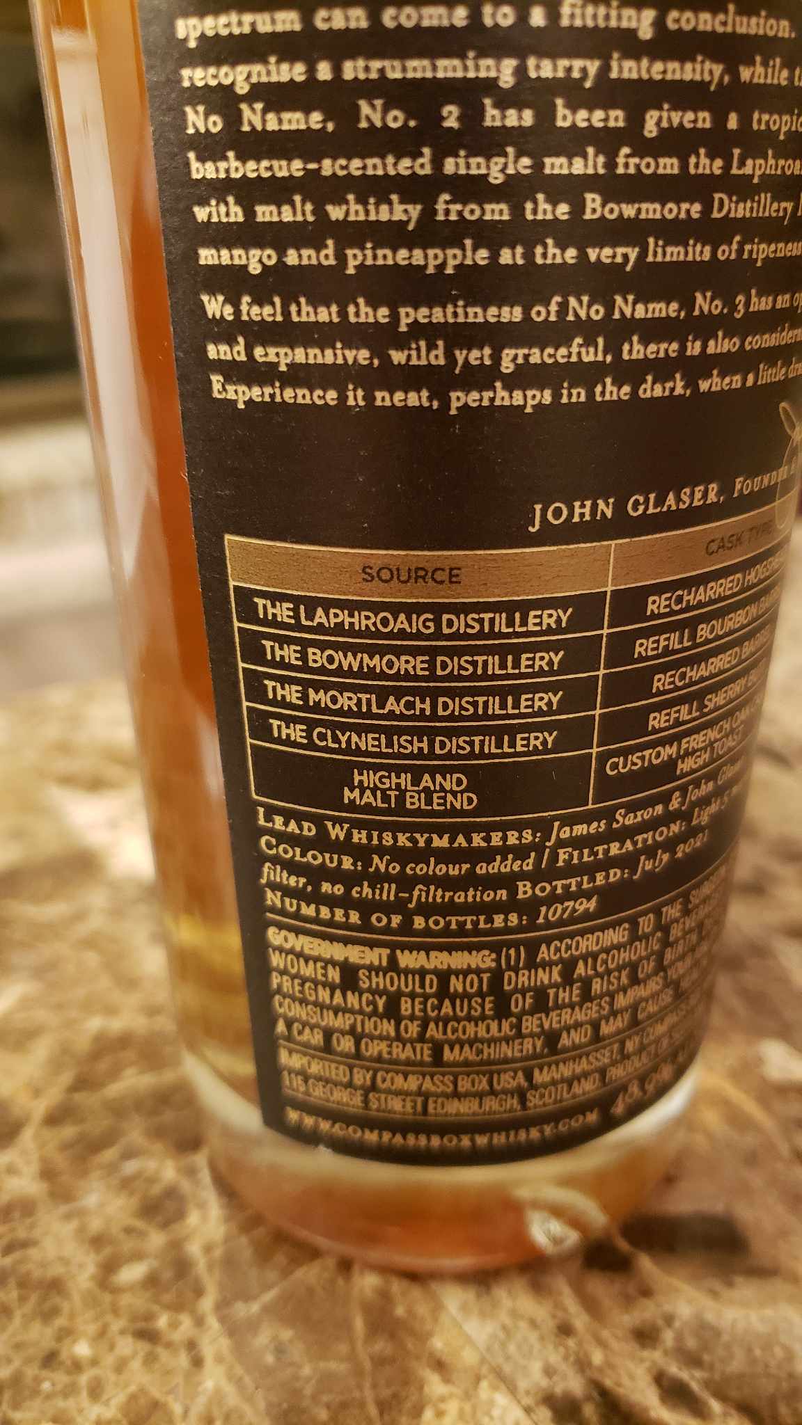
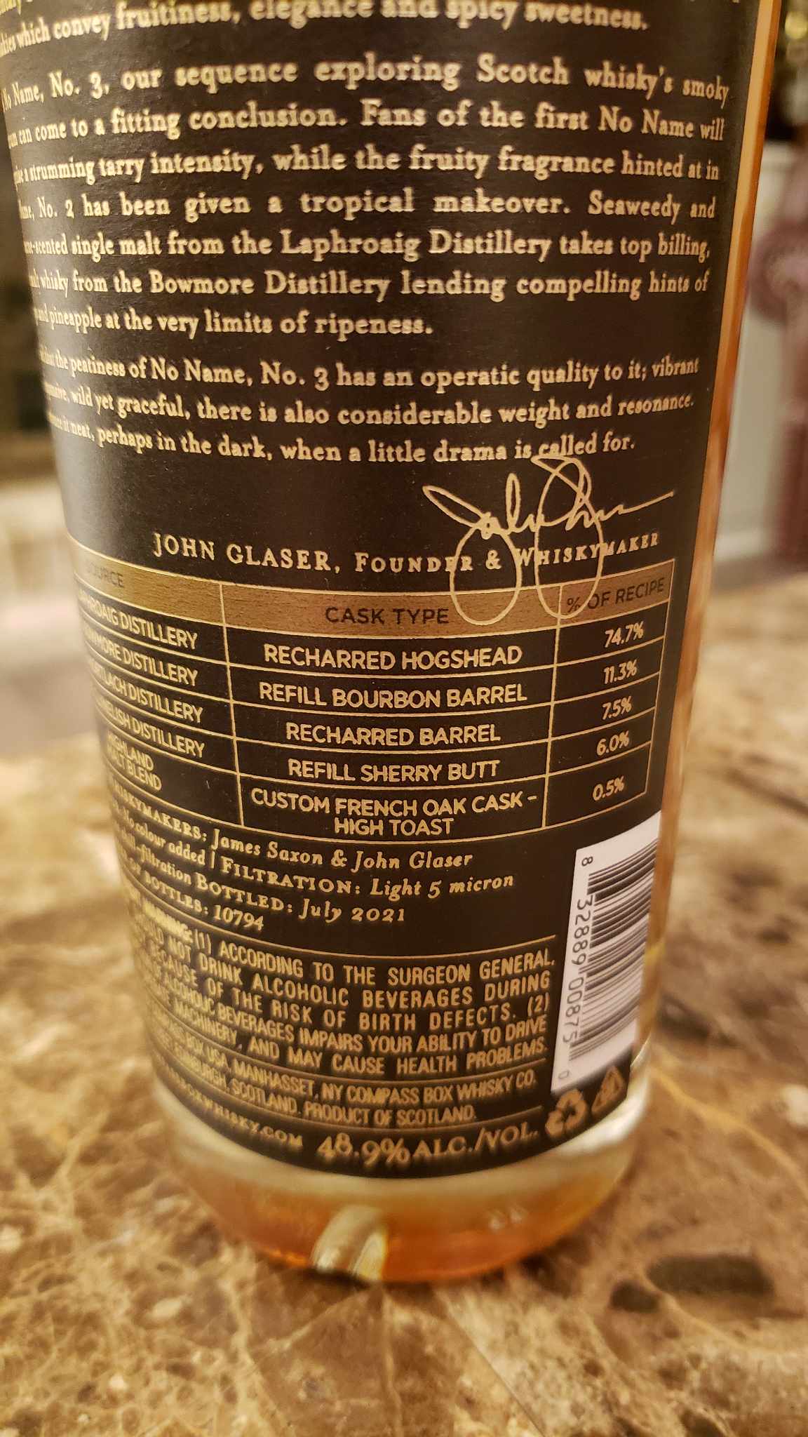
In the mid-2010s, Compass Box began releasing detailed breakdowns of certain whiskies. These breakdowns included:
- The exact distilleries used
- The percentage of each component
- The age of each component whisky
- The types of casks used for maturation
This level of detail was almost unheard of in Scotch. By doing this, Compass Box treated consumers as knowledgeable and curious. The company believed that understanding the recipe would deepen appreciation rather than reduce magic.
The Compass Box Scotch Whisky bottle labels became a symbol of that belief, that clarity and craft can go hand in hand.
2. Conflict with Regulations
In 2015, the Scotch Whisky Association (SWA) informed Compass Box that listing multiple ages on labels could violate regulations. According to the law, only the age of the youngest whisky could be emphasized. Displaying older ages alongside it might confuse consumers.
This created a tension between transparency and regulation. Compass Box argued that providing factual information should not be considered misleading. Their position was that hiding details actually creates more confusion than sharing them.
This disagreement sparked industry-wide discussion about how Scotch labeling laws should evolve.
3. The Transparency Campaign
In 2016, Compass Box launched the Scotch Whisky Transparency campaign. Their aim was not to force all producers to disclose recipes, but to allow those who wished to share information to do so legally.
The campaign compared whisky labeling to food labeling. In many industries, consumers can see ingredients, percentages, and sourcing details. Compass Box believed Scotch should move in a similar direction.
Even though regulations did not immediately change, the debate itself was important. The Compass Box Scotch label became associated with consumer rights and modern thinking.
4. A Practical Workaround
When legal change proved difficult, Compass Box adjusted its strategy. Instead of printing every detail on the front label, they made information available through their website or by request.
This allowed them to stay within the rules while continuing their commitment to openness. It also showed flexibility – they were not trying to break the system, but to improve it.
How This Changed Scotch Whisky Label Designs
The impact of Compass Box can be seen not only in laws and debates, but in how Scotch bottles look and communicate today.
1. More Informative Labels Across the Industry
In recent years, more brands have started including:
- Detailed tasting notes
- Information about cask types
- Stories about sourcing and blending
- Background information on production
This shift suggests that consumers now expect more than just an age statement. While not every brand matches the detail mentioned in the Compass Box Scotch Whiskey labels, the general trend toward greater openness is clear.
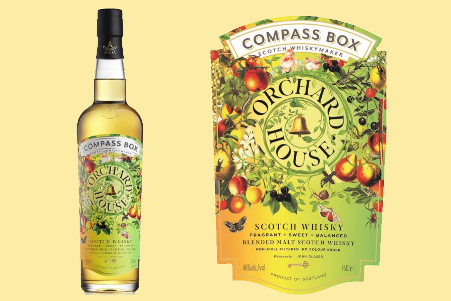
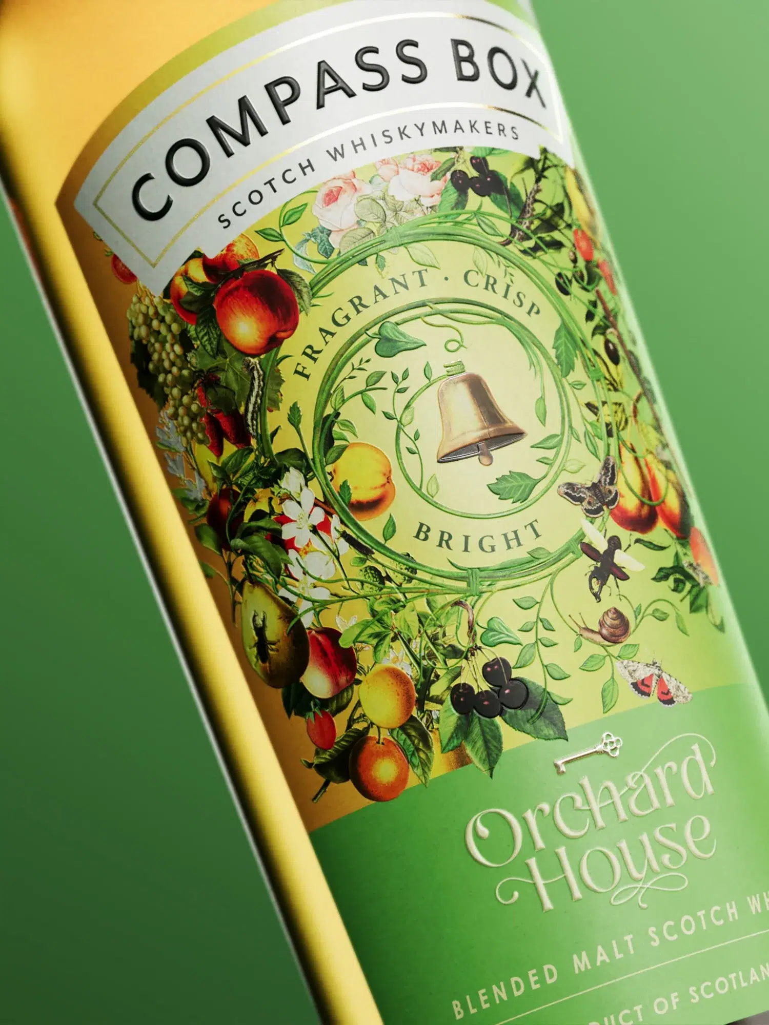
2. Labels as Storytelling Tools
Compass Box treats its label as a true storytelling platform. The design often includes bold artwork, detailed back labels, and sometimes digital links such as QR codes.
This approach transforms the bottle from a simple container into an informational or consumer educational tool. The label explains not just what the product is, but why it was created and how it was brought together.
By doing this, Compass Box helped redefine what a Scotch label could do. Not just decorate … it could inform, educate and even inspire.
3. Shaping Consumer Expectations
Modern whisky consumers are more informed than ever. Online forums, tasting clubs and social media have created a culture of curiosity and knowledge.
Because of brands like Compass Box, consumers now ask questions such as:
- Which distilleries are included?
- What casks were used?
- How was the blend structured?
The Compass Box Scotch whisky labels helped normalise these queries. Transparency became part of the premium experience rather than a technical detail.
A Broader Shift in the Industry
Compass Box did not completely transform Scotch overnight. But it played a key role in encouraging a change.
Today, many Scotch brands emphasize:
- Craft and blending philosophy
- Clear flavor descriptions
- Origin stories and production methods
- Authenticity over mystery
The design language of Scotch packaging has evolved. Bottles are often more modern, visually striking and informative. Transparency is increasingly seen as a competitive advantage rather than a threat.
Compass Box showed that being open does not weaken a brand. In fact, it can strengthen trust and build loyalty.
Enthof’s Take
The story of the Compass Box Scotch label is not just about packaging. It is about a point of view. It represents a shift from secrecy to clarity and from tradition alone to tradition with innovation.
By publishing recipes, challenging regulations and treating consumers as informed partners, Compass Box quietly reshaped Scotch label design. Its influence can be seen in the growing emphasis on storytelling, education and authenticity across the industry. In the end, Compass Box proved that transparency and creativity can coexist with heritage. And sometimes, the most powerful reinventions happen not through loud disruption, but through steady commitment to principle.
But if Compass Box want to take this a notch higher, the next evolution isn’t just more information. It’s smarter and more usable information.
Move From Transparency to Interpretability
Transparency answers: What’s inside?
Interpretability answers: What does that mean for me?
Most consumers don’t automatically understand how a 21% Refill Hogshead from one distillery vs a 39% First-Fill Sherry Butt from another distillery will affect the flavour.
That level of detail is valuable, but only to enthusiasts.
Compass Box could lead again by translating data into decision-friendly tools:
- A simple flavour intensity scale on every bottle
- Clear icons for peat level, sweetness, spice, fruitiness
- A “Who is this for?” section (New to Scotch / Peat Lovers / Sherry Fans)
- Side-by-side comparison charts on their website
This would make the Compass Box Scotch Labels not just transparent, but practical and intuitive.