Why Colour Psychology in Email Marketing? If you have observed, colour influences many aspects of our everyday life, including the clothes we wear, the food we consume, the walls that surround us, and the goods we buy. If you don’t like the colour of a garment, you can return it to the store. You’re returning nail paint if it doesn’t match your skin tone. It’s not coming home with you if the couch doesn’t fit your colour scheme.
So it stands to reason that if your email marketing uses too much colour, whether it’s too bright, too drab, or just too much, you won’t get the click-throughs you want. This is where using colour psychology in your email marketing efforts may help.
Color’s Importance in Marketing
When it comes to choosing a product, a visual appeal takes precedence over other factors, with 85% of buyers stating that colour is the most important factor in their selection. When utilized correctly, colour may help companies attract the type of customers they want.
The colours red and yellow, for example, are appealing to youngsters, but red is also utilized to stimulate haste and appetite, which is perfect for a fast-food restaurant.
Starbucks’ mermaid logo incorporates green to suggest a sense of calm or the urge to unwind with a cup of coffee.
The colour blue, which is utilized by PayPal, evokes feelings of safety and confidence in the brand – your money is secure with us.
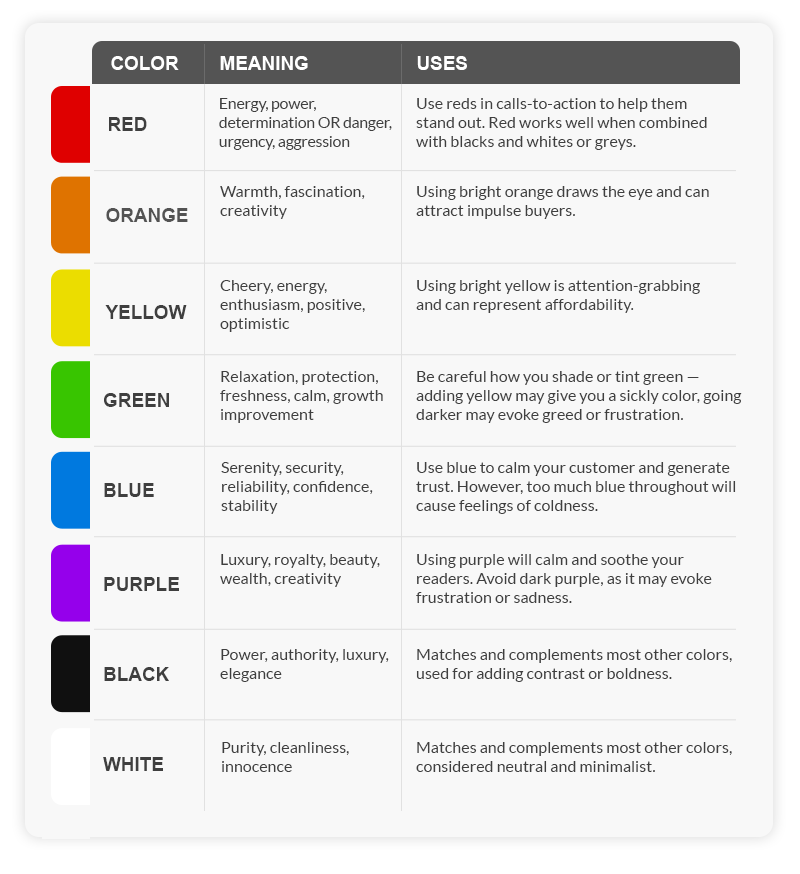
Colours and Their Meanings
The following is a list of colours and the emotions they may elicit.
Incorporating Colors into Email Marketing
It’s critical to consider your customers’ colour preferences when designing your emails. If you’re not sure what your consumers find appealing, use A/B testing to discover which combinations perform best.
Here are a Few More Guidelines to Remember for Colour Psychology in Email Marketing:
- Stick to three colours in your email newsletters to avoid overcrowding.
- Stick to your business colours if you’re bored of coming up with new colour combinations for every email.
- Is your email visually appealing? Are there any colours that mix in? Is the text causing you to squint?
- Make use of colour on purpose: Hues that are brilliant grab attention, whereas neutral or darker colours soothe.
- Use naturally existing, complementary colour combinations like pastel blue and pink, or warmer colours like yellow and orange if you’re not sure which colour combinations would work.
More successful emails and happier consumers will result from using the correct colours in your email marketing plan. Remember that colour has an effect on mood, so getting it right will result in more opens, click-throughs, and sales.
About the Author
 Donald Gonsalves is the founder of Enthof Creatives and a regular writer for the website’s blog. He has more than 2 decades of experience in marketing, sales and branding. His need to research and learn more about these segments is never-ending. To contact him, just drop an email to donald.g@sh118.global.temp.domains
Follow him on Linkedin – https://www.linkedin.com/in/donaldgonsalves