Take a quick walk down any supermarket aisle and you will find a wall of purple belonging to Cadbury. Keep reading as we take you through the history and evolution of Cadbury Branding.
Cadbury Branding – The Beginning
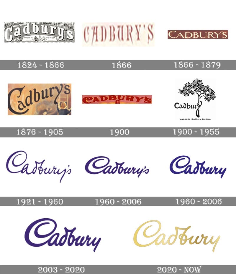
John Cadbury, an English grocery store owner, opened his first shop in Birmingham in 1824. His goal was to sell healthier drinks as an alternative to alcohol. Cadbury personally ground handmade chocolate and cocoa with mortar and pestle. The original logo was a reflection of the time, a serif typeface that was charming and trustworthy that would look great on any high street.
Cadbury1824 Logo
Cadbury was the first to introduce chocolate in the UK during the 1800s. Cadbury was the first to create a solid piece of chocolate that could be bitten into. Previously, chocolate was only consumed as a beverage.
Dairy Milk
Fast forward to the 1900s, when Cadbury Dairy Milk Chocolate was born. Their solid chocolate sales soared. J.S. Cadbury was merged with Cadbury. Fry expanded into Australia and merged with J.S. It was a smart business move since the first international customers of Fry were Australians.
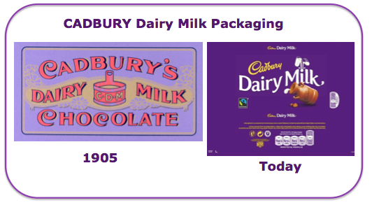
Cadbury’s brand changed dramatically after the introduction of Diary Milk. The 1905 branding features a pale purple background and red type. It is quite a contrast to the Cadbury purple that we know today.
Cadbury Dairy Milk Packaging 1905
The Cadbury Branding or brand’s identity evolved over time into the one we now know.
Notably, for Cadbury Branding, the company adopted the famous purple in the early 1900s as its primary colour – Pantone 2658 C. However, Cadbury lost this right in 2013 and began to claim sole rights to that particular shade in 1995. Cadbury uses the iconic colour with unregistered rights.
The evolution of Cadbury’s Dairy Milk branding since the 1900s
Although the first Cadbury script logo was seen on the transport fleet in 1921 it did not appear on any major branding until the 1950s. Because it is based on William Cadbury’s signature, the script type is closely linked to Cadbury Branding.
Cadbury Dairy Milk logo 1921
Their Chocolate is Made with a Large Glass and Half of Milk
In 1928, Cadbury’s iconic Glass and a Half symbol were created. It represents the amount of milk in Cadbury chocolate recipes. Globally recognized, the symbol and the phrase “there’s always a glass and half in everyone” are synonymous with Cadbury chocolate brands. They represent kindness and generosity. You can think about the number of boxes you have brought along with you to get-togethers with friends. Or how Cadbury Easter eggs and bunnies are always a good choice.
2020 – Current Cadbury Branding
Did you notice the Cadbury Dairy Milk blocks looking different this year as you browse the chocolate aisle?
This is because Cadbury Dairy Milk and Cadbury Dairy Milk underwent a brand update.
Bulletproof designed a new brand that is more modern and debuted in Australia in 2020. It was also introduced in the UK in January 2019. The latest Dairy Milk packaging will show 1905 scattered throughout the background pattern. This subtle nod to the company’s history is evident. There have been some updates to the script logo. The logo now has a lighter weight and is horizontally positioned, rather than at the angle it used to be. You’ll also notice that the d, _ b ligatures are slightly different.
The brand’s most recent update features a subtle, modern design while still keeping its traditional and identifiable elements.
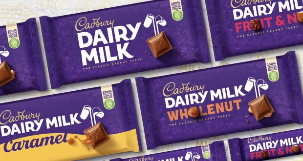
Cadbury 2020 packaging image
Are you looking for ways to update and evolve your company’s brand just like Cadbury Branding? The Enthof Creatives team is here to help with brand identity, strategy and digital marketing. Get in touch today!
Also Read: Cultural Sensitivity in Global Branding
